
The Evolution of Design
When card №01 was printed back in 2024, nobody imagined the series would still be running more than 1000 cards later. What started as a small run of holographic portraits for a handful of Whatnot friends has quietly evolved through four back designs and three clear front-side eras — each one shaped by what the community needed at the time.
Here's a look at how the design has changed, era by era.
Era 1 — 2024 to 2025
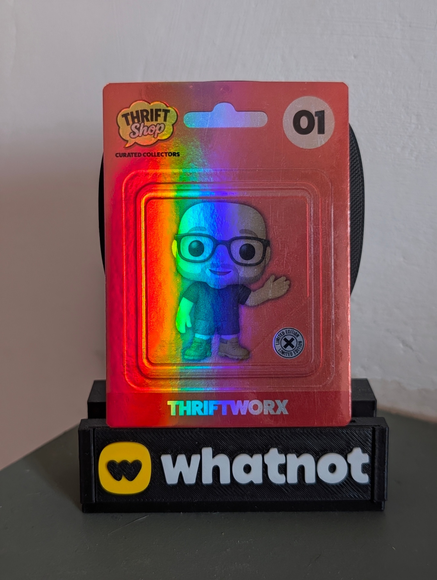
The first era covers roughly cards №01 through №100, when the project was still finding its feet. The very first fronts leaned into the Pop-collector world the cards were born from: each one was framed to look like a blister-pack figure, complete with the THRIFT SHOP CURATED COLLECTORS header, a small number badge in the top-right, and the seller's Whatnot handle running along the bottom. The whole thing sat under a rainbow holographic foil that caught the light like a chase Pop.
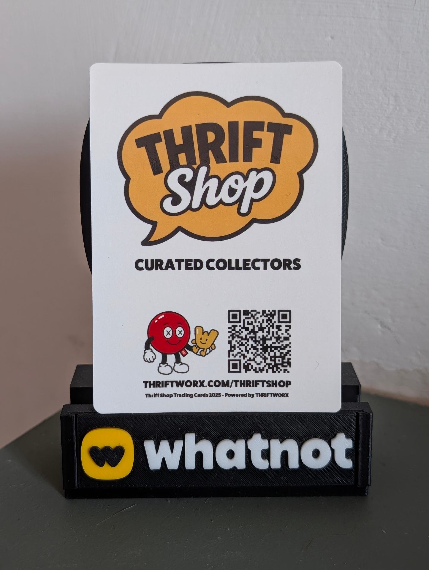
The back was clean and unmistakable — a big Thrift Shop speech-bubble logo on a white card, CURATED COLLECTORS underneath, and a QR code linking straight to THRIFTWORX.COM/THRIFTSHOP. It felt like packaging, not a trading card, and that was the point.
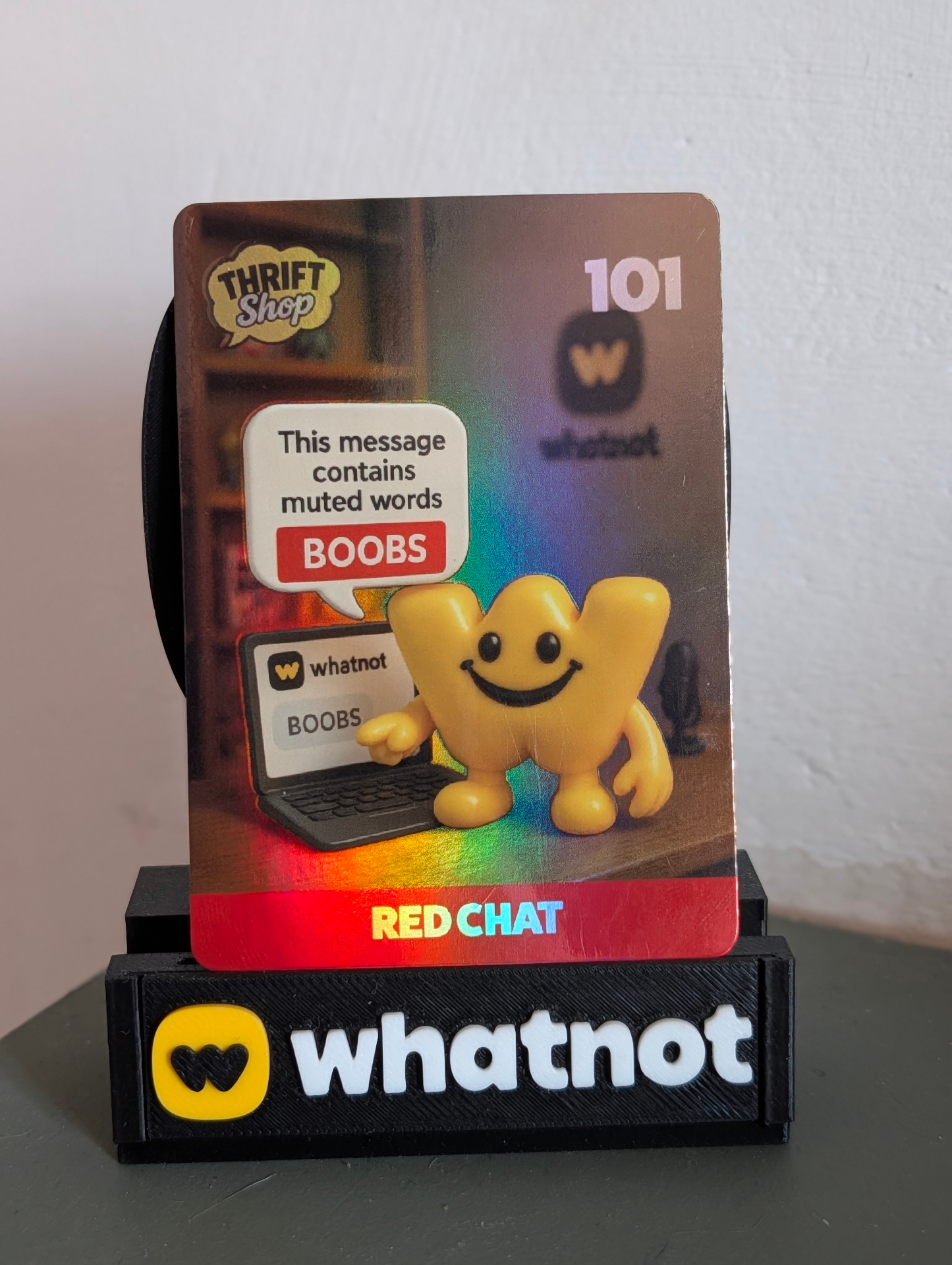
Around card №101 the front started to breathe. The blister-pack frame was retired and the artwork was allowed to fill the whole card — richer scenes, characters interacting with props, and a small Thrift Shop bubble logo tucked into the top corner alongside the card number. The seller's handle moved to a coloured banner along the bottom, which gave each card its own signature stripe of colour.
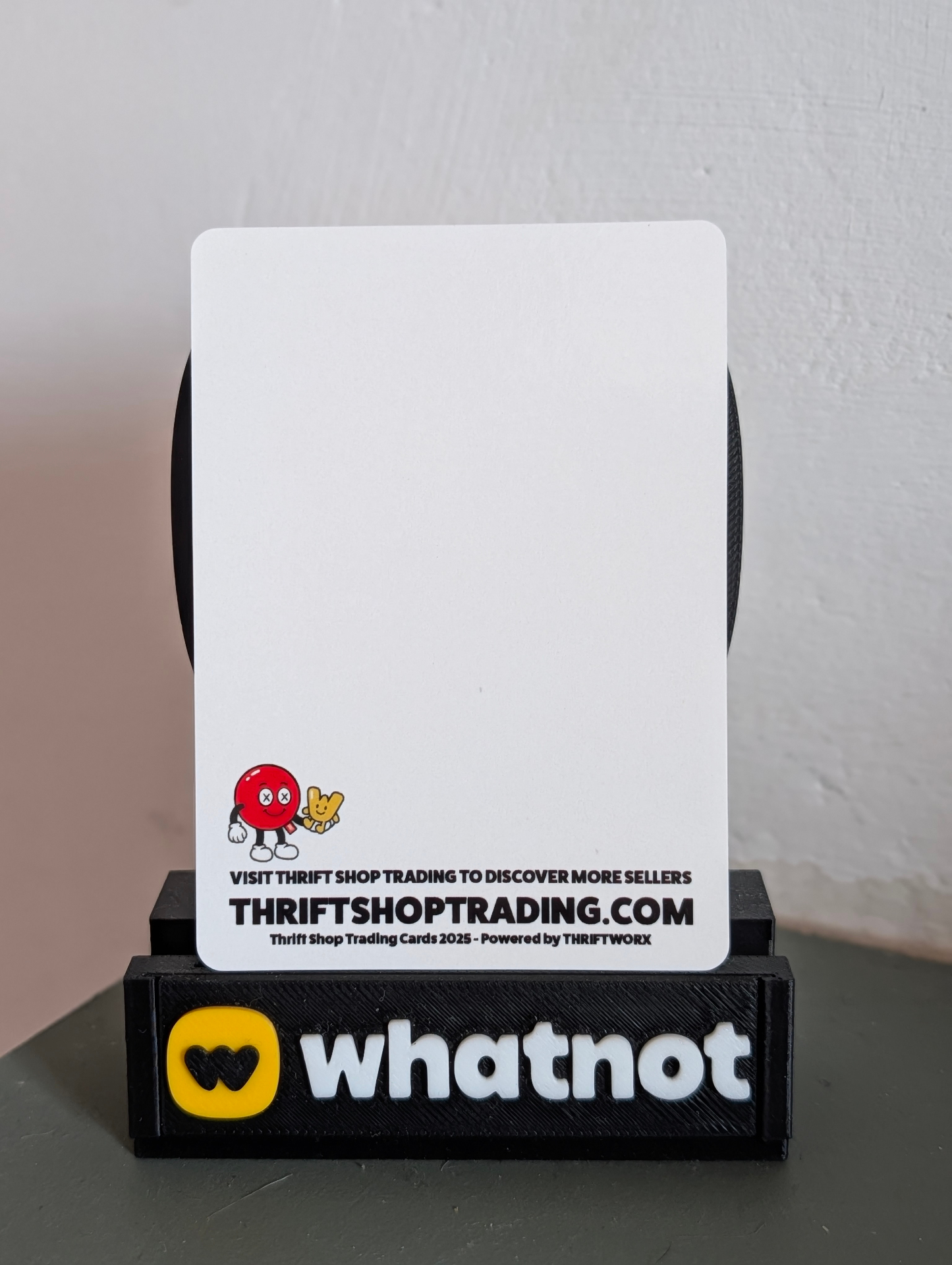
The back went the other direction — stripped almost entirely blank. Just the little red-and-yellow mascot duo in the bottom-left, VISIT THRIFT SHOP TRADING TO DISCOVER MORE SELLERS, and the THRIFTSHOPTRADING.COM URL. The empty white space was intentional: it left room for signatures, doodles, and personalisation from the sellers themselves.
Era 2 — 2025 to 2026
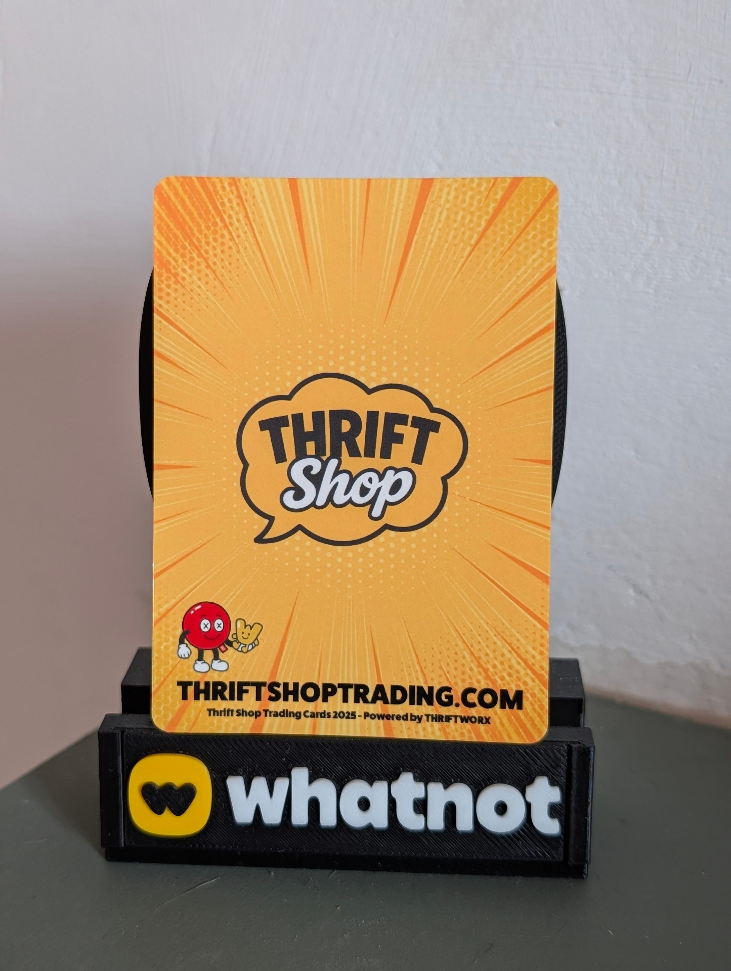
The second era spans roughly cards №200 to №500, when the series had a proper visual identity to protect and the back finally got a design of its own. Out went the blank white; in came the now-familiar yellow comic-burst — halftone dots, radiating speed lines, and the Thrift Shop speech-bubble logo dead centre. The little mascot moved down to the bottom-left, THRIFTSHOPTRADING.COM sat proudly across the base, and the small print quietly read Thrift Shop Trading Cards 2025 — Powered by THRIFTWORX.
The fronts through this stretch stayed with the full-bleed artwork established at №101, but the production side sped up dramatically — AI-assisted image generation plus Photoshop cleanup meant new cards could go from brief to press-ready in around 48 hours.
Era 3 — 2026 to Present
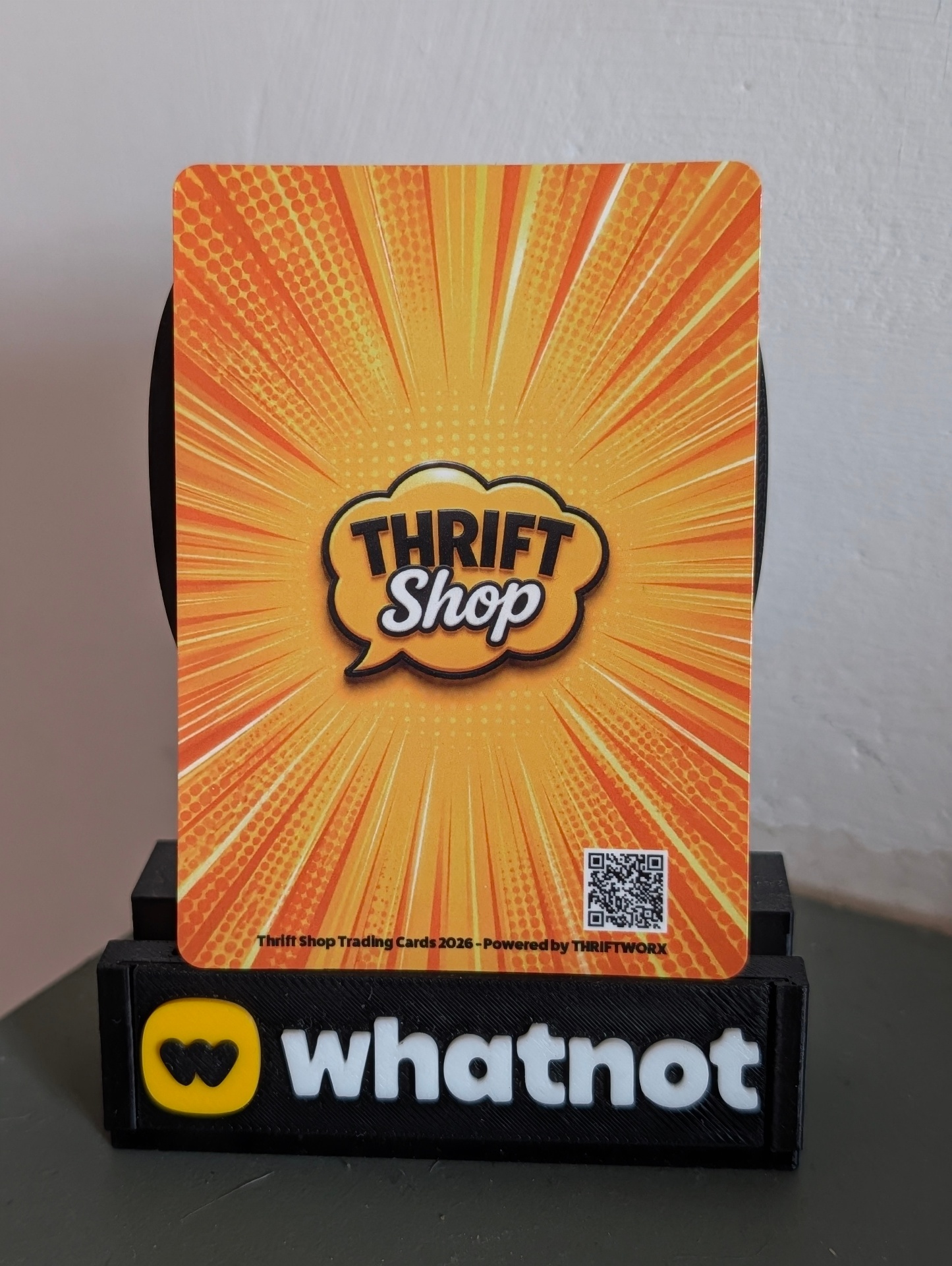
The current era begins around card №500 and continues today. The back was refined again: the yellow comic burst stayed — it had become part of the series' DNA — but the composition tightened up. The mascot and long URL line were removed in favour of a compact QR code in the bottom-right, giving the whole back more breathing room. The Thrift Shop logo grew slightly bolder in the centre, and the small print updated to Thrift Shop Trading Cards 2026 — Powered by THRIFTWORX.
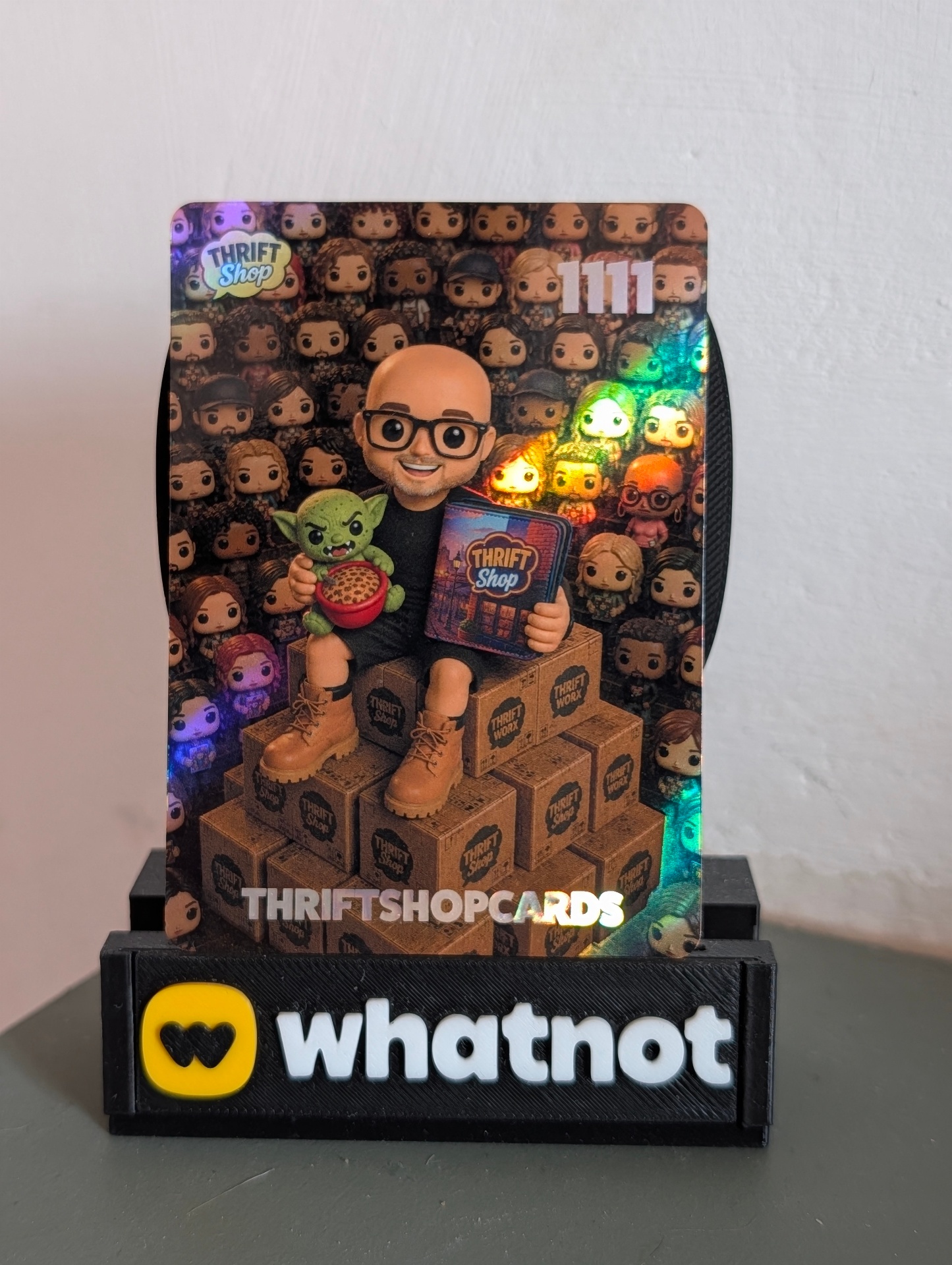
On the front, the same era brought the current look: portrait-first hero artwork with a subtle Thrift Shop mark, a large card number, and clean typography for the seller's handle at the base — as seen on the founder's own card, №1111.
The fronts, side by side
Line the three fronts up next to each other and the evolution really jumps out.
Card №01 (@THRIFTWORX) is the origin point — the Pop-blister framing dominates. A thick holographic red border wraps the whole card, the character sits inside a square inset panel like a figure trapped behind plastic, and a small LIMITED EDITION seal punctuates the corner. The Thrift Shop bubble and the 01 number badge are large and heavy, and the seller name THRIFTWORX sits inside a coloured bar along the bottom. Every element is announcing itself.
Card №101 (RED CHAT) is the moment the artwork takes over. The blister frame is gone; the illustrated scene now fills the card corner-to-corner, with proper background environment, props, and depth. The Thrift Shop logo shrinks and slides into the top-left, the 101 number moves to the top-right, and the seller banner at the bottom is thinner and more graphic — a single coloured stripe rather than a chunky nameplate. The card starts to feel less like packaging and more like a collectible in its own right.
Card №1111 (THRIFTSHOPCARDS) is the current direction, and it commits fully to the artwork. The bottom seller banner is gone entirely — the handle is now typeset directly over the image with a subtle holographic finish. The Thrift Shop mark in the top-left is smaller and quieter, the 1111 number is bigger and more confident, and the whole frame gives the character and their surroundings the largest visual real estate of any era. It's the most photograph-like of the three — no borders, no bars, just the scene.
A note on timing
Because cards move through production in the order sellers get their details in — not strictly by number — you'll always find a little overlap between eras. A card numbered in the 190s might have shipped after №220, and some early sellers came back for updated versions once new backs were introduced. That's part of what makes the collection interesting to hunt through: the design tells you roughly when a card was made, not just where it sits in the sequence.
What stays the same
Across every era, the goal has been the same — cards that feel like real collectibles for a real community. The palette, the mascot, the speech-bubble logo, and the Whatnot-first spirit have carried through every redesign. Whichever era of card sits in your binder, it's part of the same story.